
Branding and Identity


The Black Sheep Identity
This identity and branding was designed by design studio Forest in Brooklyn, New York, it is the studio of Joel Speasmaker. This is the identity and branding for a restaurant in the historic Carver neighborhood of Richmond, Virginia by Joel Speasmaker and the illustration is by Garrett Morin. I like the simplicity of this design and I think the choice of stock works well, I think printing onto white stock is used to often and its refreshing to see something different.


Maaemo Identity
This is the work of Ludvig Bruneau Rossow, from Oslo, Norway, and this is his design studio Bureau Bruneau. He designed this identity for Maaemo an 100% ecological gourmet restaurant in Oslo, Norway. I really love this identity and branding, it has been well thought out and all the components work well as a whole, and it's different, it stands out from other designs out there but the way it opens up, it adds an element of interaction which I think is always important.


Vogue Invites
This is the work of Shaz Madani, she has designed the identity and branding for the invites for Topshop and Vogue's SS09 trend previews. She has used screen-print for the transparent slip for cover, and then for the inserts printed with patterns from the different collections. I think they are really well designed and printed, there isn't too much going on and the designs are well thought out, using the patterns from the prints of the collections. I am also a big fan of patterns so I really appreciate this design.
Packaging and Promotion

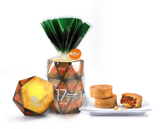

TK Food Pineapple Pastry
This packing for TK Food Pineapple Pastry was designed by Victor Branding Lab, based in Taiwan. This series adopts the appearance of pineapple as packing design, which
represents a whole pineapple but is actually individual boxes incasing pineapple pastries. I think this design is really clever, I love how the apperace of a real pineapple is created but is then deconsructed into each different part of the packaging, I also think the outer packaging that holds it all together with the green printed at the top is a nice finish and creates a finished product.


Vitale Pet Food Packaging
This dog food packagin was designed by Sergey Grigoryan, he says 'I designed a line of dog food
for the animal lover who wants to feed their dog quality and nutritious
natural food.' I think the amusing take to this pacakging makes it stand out from other pet food, it also personifies the animals more and adds a more friendly approach. Sergey Grigoryan also uses butcher
paper to give the product a handmade feel, which I think is a really nice touch.
http://www.grigoryancreative.com/


Lega-Lega T-shirts
The packaging for Lega-Lega t-shirts come in a specially designed
gable top carton, designed by MIT in Croatia. Inside the carton is a Lega-Lega t-shirt and sketchbook. I think this is a really inovitive and different way of packaging clothing, when I first looked at it I didn't even know there was a t-shirt inside, I thought it was a drink. I think this type of packaging is really inventive and creative, you feel like you are getting the product but also the packaging feels like a product in itself.
Publishing and Editorial


Communal Table is a series of cookbooks that 'celebrates the joys of gathering together to share a meal.' They are designed by Forest design studio which is the studio of Joel Speasmaker based in Brooklyn, New York. These are quirky little publications, I think the illustrations give them a really homely and friendly feel which is probably a good message to send out with a cookbook. There is also an element of humour running through them which I think always adds to making a piece of design connect with the audience more.
http://www.thisisforest.com/


Pure Magazine Issue 3
Pure magazine is designed by Jan Estrada and can be seen on his online portfolio Survival Mode, he is a designer based in Warsaw. Pure magazine is about Finnish culture and lifestyle and is published by Finlandia Vodka. I really like this magazine, mainly because of the layout used. I particularly like the page when the image takes up the whole grid, there are not gutters or boarders, I think the layouts vary enough through the publication to keep the layout of the magazine interesting and fresh.
http://www.survivalmode.pl/


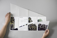
In Situ
These publications are from Say What Studio stituated in Paris, they consist of collection of books pamphletson the theme of European architecture. What I find interesting about these books is the way they unfold and open up to reveal more content. Also the way it has been printed has obvioulsy been thought out and planned really well as it all has to fit together and line up when it is folded. I think its really clever and makes it stand out from other books that may be out there.
http://www.saywhat-studio.com/en/ 


Communal Table
http://www.thisisforest.com/
Information and Wayfinding

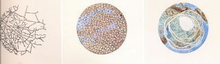
 These infographic designs are done by Caroline Fabes, I found them whilst looking through Data Flow 2. Each letter is represnted by a different colour square and the punctuation marks are in the greyscale spectrum. I really like the idea of codes and the slight mystery that they have. I also think this would be really nice for print as the colours could all be matched up properly with Pantone.
Data Flow Two


L'Aventure Des Ecritures/L'Image Du Texte
Data Flow Two

Reflex Points
Feet From Visual Aid
This piece of infographic was designed by Draught Associates, I think its a really nice piece of design. Medical infographics can often be boring, dull and very serious. Whilst this is still informing about a medical matter it is more light hearted and intresting to look at. I think as a medical student this would help you learn as it is more visually engaging.
Data Flow Two

Herr F. Und Ich
Lars Thorben Fischer organised all this clothes by colour and material, there are over 200 items shown in this infographic. It was first a wall installation and is now a book which opens out into a poster. This infographics is nice in the way it is interactive and comes apart and opens up to reveal more, it also has a sense of the designer as you see the contents of his personal wardrobe, its well organised and is visually intresting to look at.
Data Flow Two


No comments:
Post a Comment