
Packaging and Promotion

Family owned & operated Olivanica have been producing fine quality olive oil for a while, the packaging is designed to reflect that. Foiling is used on the logo and the type to give it that more special touch to it which is probably is ment to reflect the quality of the oil inside the packaging.
http://toastdesign.com.au/
 This bottle lable design is by Motherland design studio, the use of foiling on this bottle is really well designed and gives it that touch that makes it stand out and gives it a feel of specialness and importance. I also like how the foiling isn't gold its a bronze more warm colour which I really enjoy.
http://www.motherland.se/
 I really like this packaging a lot, it is something I would like to produce and suits my style, I like both the elements to it, the brown corogated card to make the main component is really simple and well made. The sleeve has that added touch of being embossed which adds a bit of something special to balance out with the simplicity of the main box. Simple yet effective.
http://conorwhelanwork.tumblr.com/
 Again some simple but really clean and crisp packaging with the embossed detail. This is packaging for the Bite Me brand was developed based on the concept of healthy life
with correct portions. The packaging is taking into consideration the percentage of
cocoa. The more the percentage of cocoa to milk and other ingredients
the bigger the chocolate size and vise versa.
Again some simple but really clean and crisp packaging with the embossed detail. This is packaging for the Bite Me brand was developed based on the concept of healthy life
with correct portions. The packaging is taking into consideration the percentage of
cocoa. The more the percentage of cocoa to milk and other ingredients
the bigger the chocolate size and vise versa.
http://www.vasilykassab.com/
Publishing and Editorial


 This book has got some very special print finishes, it must of cost a fourtune to produce this book. Its gold foiling on all the lettering and its embossed and its got old pages running through it. Its to emphasise exploiting man’s obsession with success and glory— in this case gold, hence all the gold!
http://toastdesign.com.au/

http://www.motherland.se/

http://conorwhelanwork.tumblr.com/

http://www.vasilykassab.com/
Publishing and Editorial


http://www.conorcronin.com/24/icecreamstudio-1/


 This is a really well made publication, its won awards and I can see why. The debossing on the front cover is so crisp and neat and consistent, I also like the detail in the colour on some of the words, the choice of stock and colour scheme of the book all works well together with the print deatail.
http://www.behance.net/gallery/The-years-are-sailing-by/475750

 Some use die cutting here on this publication, the front cover of the sleeve is die cut and each publication inside has a different colour of front cover so as you change the order of the books inside you have new colour coming through the die cut shapes. Its a simple idea but I like how it works.
http://www.behance.net/gallery/Bachelor-Thesis/435855
Branding and Identity


 This is branding for a nightclub, firstly I like the burst of bright colour, it stands up and works well for a nightclub. What makes it that bit special is the stock used and how it interacts and works to create different views wether its lifted up or not.
http://www.behance.net/gallery/Freq-Nightclub/465402


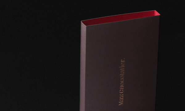
 Some fancy packaging here for Max Chocolatier, this pacakging definitly gives off a sense of class. I think that is helped by the use of the embossing and gold foiling, it just adds that special touch which makes it seem more important and puts it above other chocolate compainies.
http://www.behance.net/gallery/Corporate-Brand-Identity-Max-Chocolatier-Schweiz/223627

 A business card with a difference, I would definitely take one of these even if I had no idea who the person was ot what they did, and I think that is a good trait to have as a business acrd, you want people to pick it up and have a look, it needs to stand out.


{the facebook} try to use modern style to present the
traditional Chinese culture "physiognomic".
traditional Chinese culture "physiognomic".
In this publication 57 people's facial photos and their background are recorded,
and their facial characters are analyzed by "physiognomic". There is some nice detail used in this book, the embossing on the cover and the choice and range of stocks used throughout it, I also particularly like the binding.
http://www.behance.net/gallery/the-facebook/522341and their facial characters are analyzed by "physiognomic". There is some nice detail used in this book, the embossing on the cover and the choice and range of stocks used throughout it, I also particularly like the binding.


http://www.behance.net/gallery/The-years-are-sailing-by/475750


http://www.behance.net/gallery/Bachelor-Thesis/435855
Branding and Identity


http://www.behance.net/gallery/Freq-Nightclub/465402


http://www.behance.net/gallery/Corporate-Brand-Identity-Max-Chocolatier-Schweiz/223627


http://www.behance.net/gallery/Dreamten-Studios/98718


 An identity design, simple but good design, a recurring pattern that seems to occur when I come across designs that I like, simple yet effective. There is a slight debossing around the name of the company and I like the colour that is used, it works well on the white stock, looks clean and crisp.
http://www.behance.net/gallery/Identity-Logos/445995
Information and Wayfinding


 I love this map, I think its so clever, and I want one. I don't actually know how they do this print, the map is CMYK but the scratch of foiling on the top must be a speacial type of material, I will make note to ask Lorenzo this one.


http://www.behance.net/gallery/Identity-Logos/445995
Information and Wayfinding
No comments:
Post a Comment